

TL;DR: Modern dashboards create a major delay because they force humans to stare at data rather than fix problems. This process is incredibly wasteful, costing companies thousands of times more than simply letting a computer check the numbers itself. To solve this, businesses must stop building passive screens and start building "Decision Engines" that automatically fix issues the moment they happen.
If Tesla can do it, so can you.
Part I: The Deconstruction
The “Read-Only” Trap
The Definition of an Administrative Artifact
A dashboard is defined as a high-latency, read-only interface that relies on human cognitive processing to bridge the gap between a data signal and a business decision. It’s an “Administrative Artifact”—a tool that exists solely because the underlying system lacks the intelligence to resolve exceptions autonomously.
In the era of Generative AI and automated reasoning, the dashboard represents a broken feedback loop. It forces a Context Switch: the user must observe a signal in one interface, synthesize the information biologically (using the brain’s limited working memory), and then navigate to a separate interface to execute a corrective action. This separation of “Signal” from “Execution” is the primary source of latency in the modern enterprise.
Deconstructing the “Control” Fallacy
The industry consensus operates on a stuck belief: “If I can visualize the data, I am in control of the outcome.”
The Socratic Challenge:
Clarification: What is the definition of “Control”? In cybernetics and control theory, control is defined as the ability to influence the state of a system.
The Disconnect: Does staring at a speedometer change the velocity of the car? No. Only the accelerator (the input mechanism) changes the velocity. The speedometer is merely a lagging indicator of the state.
The Reality: Most executive dashboards are sophisticated speedometers disconnected from the engine. They provide Situational Awareness, not Operational Control.
The Metric: Time-to-Action (TtA)
The efficiency of a decision system is measured by Time-to-Action (TtA): the duration between a pixel changing color on a screen and a corrective command being executed.
The Dashboard TtA: In a standard dashboard-centric workflow, the TtA is measured in days or weeks. A metric turns red on Tuesday; the manager reviews the dashboard on Friday; the meeting is held on Monday; the decision is made on Wednesday.
The “Read-Only” Tax: Because the dashboard is “Read-Only,” it can’t resolve the issue it identifies. It can only scream for attention. This creates a “Data Voyeurism” culture where organizations pay millions to watch their problems rather than fix them.
The Cognitive Gap
The fundamental flaw of the dashboard is its reliance on the “Human-in-the-Loop” for routine data processing. By funneling gigabytes of real-time data into a visualization, we force the slowest processor in the chain (the human brain) to act as the router.
The Bandwidth Mismatch: Databases process millions of rows per second. The human visual cortex processes ~7 chunks of information at a time (Miller’s Law).
The Result: Information bottleneck. The dashboard does not empower the user; it creates a “Cognitive Debt” that accumulates until the user ignores the signal entirely (Alert Fatigue).
“The future of business intelligence is not better visualization, but zero visualization. A perfectly optimized system resolves its own variances and reports only the exceptions it can’t handle, effectively moving the enterprise from a ‘Read-Only’ state to a ‘Write-Enabled’ state.”
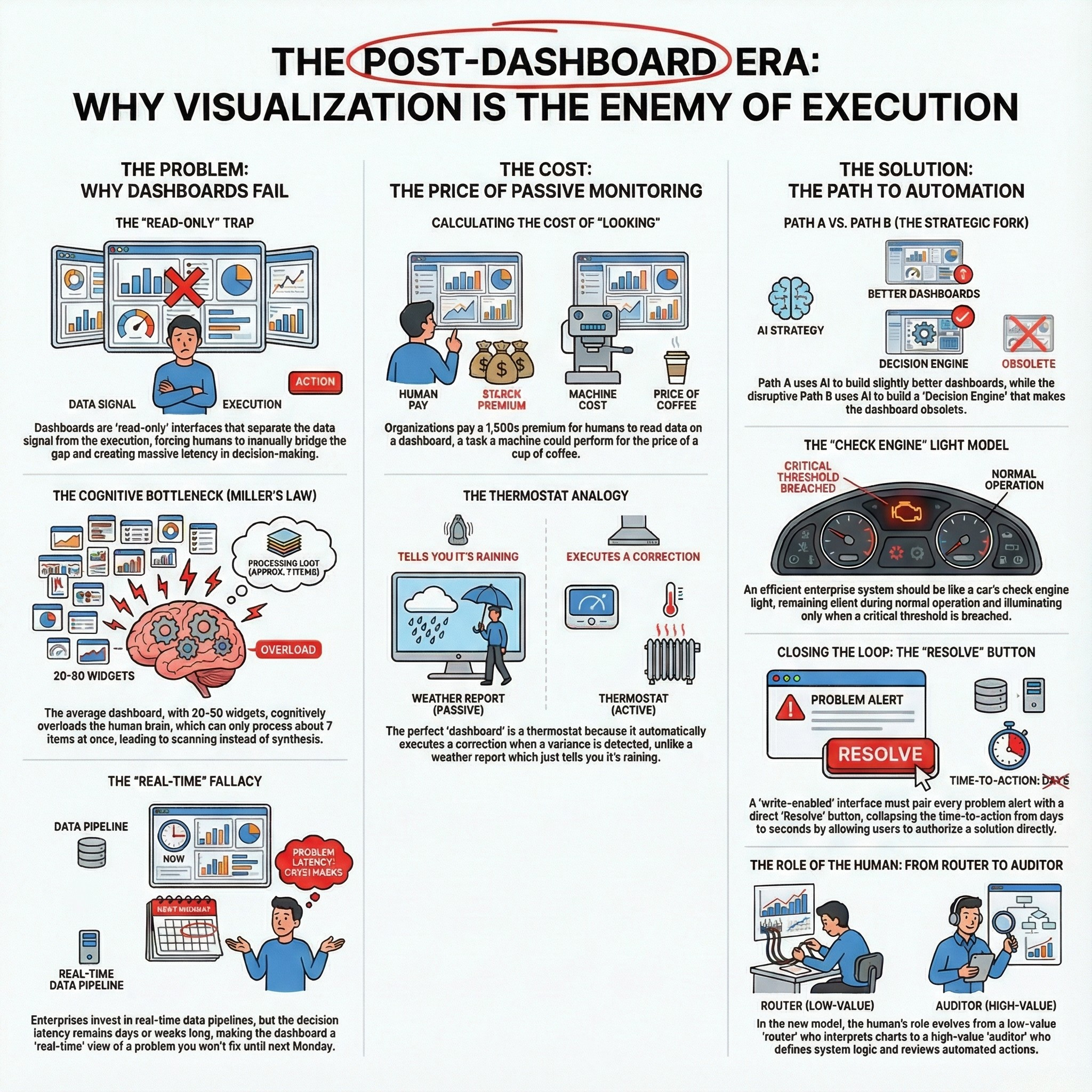
The Cognitive Bottleneck (Miller’s Law)
The Biological Limit of Business Intelligence
The central conceit of the modern dashboard is that humans are capable of processing complex, multivariate correlations simply by “looking” at them. This assumption violates Miller’s Law (1956), a foundational principle of cognitive psychology which establishes that the average human working memory can hold only 7 ± 2 items simultaneously.
The Saturation Point: The average enterprise Executive Dashboard contains between 20 and 50 distinct widgets (KPI cards, sparklines, bar charts).
The Cognitive Failure: When presented with 50 widgets, the human brain does not synthesize; it scans. It relies on heuristics and confirmation bias to filter the noise, ignoring 90% of the data presented.
The “Fluff” Anchor: To compensate for this cognitive overload, dashboard designers prioritize Aesthetics over Utility. We replace “Insight” with “Decoration.” A dashboard is deemed “good” if it looks professional, regardless of whether it reduces the Time-to-Action (TtA).
The “Exception Handling” Failure
In computer science, “Exception Handling” is an automated process where the system detects an anomaly and executes a specific subroutine to resolve it. In Dashboard Theory, exception handling is manual.
The “Needle in the Haystack” Protocol: A dashboard displays 100 metrics that are “Green” (Normal) to hide the 1 metric that is “Red” (Critical).
The Inefficiency: This forces the executive to expend cognitive energy validating that the system is working, rather than focusing entirely on where it is failing.
The First Principles Correction: A system should remain silent when it is functioning within agreed parameters (Control Limits). It should only speak when a threshold is breached.
“A dashboard is an admission of failure. It exists because the system is not smart enough to handle the exception itself. The goal of the Architect is not to build a better view of the haystack, but to build a magnet that extracts the needle.”
The Latency Illusion
The “Real-Time” Fallacy
Enterprises invest heavily in “Real-Time Streaming Architecture” (Kafka, Flink) to pipe data to dashboards, yet the consumption of that data remains a batch process.
The Speed of Light vs. The Speed of Organization: Data travels from the sensor to the warehouse at the speed of light. However, the insight travels from the warehouse to the decision at the speed of the Weekly Business Review (WBR).
The Latency Calculation:
Data Latency: 200 milliseconds (Real-time).
Decision Latency: 5 Business Days (Batch).
Net Result: The dashboard is a “Real-Time” view of a problem you will not fix until Monday.
The Rearview Mirror Effect
Because of this decision latency, the dashboard functions exclusively as a “Rearview Mirror.” It confirms what has happened, but rarely provides the affordance to influence what will happen.
The Leading Indicator Trap: Even when dashboards display “Leading Indicators” (e.g., Pipeline Velocity), the action taken on them is lagging.
The “Voyeurism” Tax: This latency creates a culture of “Data Voyeurism.” Managers feel productive because they are watching the metrics change, but without a direct, automated link to execution, they are merely spectators to their own P&L.
“Real-time data without real-time execution is just expensive anxiety. If the latency of the decision is measured in days, the millisecond latency of the data pipeline is irrelevant waste.”
Part II: The ID10T Audit (Efficiency Delta)
Calculating the Cost of “Looking”
The ID10T Index Applied to Dashboards
To understand the financial toxicity of the dashboard model, we need to apply the ID10T Index (Inefficiency Delta in Operational Transformation). This formula calculates the gap between the Current Commercial Price of a process and its Theoretical Minimum Cost (the limits of physics and logic).
The Current Commercial Price of a dashboard is not the software license cost (e.g., Tableau, PowerBI); it is the cost of the Human Labor required to create, maintain, and consume it.
The Numerator: The Cost of Human-Led Monitoring
Let’s audit a standard “Executive Revenue Dashboard” using Standardized Labor Rates (L3 Professional @ $300/hr and L4 Elite @ $800/hr).
Creation & Maintenance (The “Data Janitor” Tax):
A dashboard is rarely static. It requires constant data hygiene, schema updates, and “ad-hoc” requests.
Input: 1 Senior Data Analyst (L3) spending 40 hours/month on maintenance and “cuts” of the data.
Cost: 40 hours × $300/hr = $12,000/month.
Consumption (The “Meeting” Tax):
The data is reviewed in a Weekly Business Review (WBR) attended by 10 Executives/VPs (L4).
Input: 10 Executives × 2 hours/week × 4 weeks.
Cost: 80 hours × $800/hr = $64,000/month.
Total Numerator (Current Price): $76,000 per month.
Note: This excludes the cost of cloud compute and software licenses. This is purely the cost of the human cognitive layer.
The Denominator: The Physics Limit of Logic
What is the First Principles function of this dashboard? It is to check if Revenue < Target.
The Bits Floor: The cost of a digital transaction (an API call or SQL query) is effectively zero, bounded by the cost of electricity. Let’s assign the Agentic Limit of $0.01 per transaction.
The Logic: An automated script runs the query:
IF revenue < target THEN trigger_alert.Scale: Running this check every hour for a month (720 checks).
Cost: 720 × $0.01 = $7.20/month.
Regulatory Floor: Even assuming a human must press a “Approve” button once a month (L4 rate for 5 minutes), the cost is negligible (~$66).
Total Denominator (Theoretical Minimum): ~$50 per month.
The Efficiency Gap
Numerator: $76,000
Denominator: $50
ID10T Score: 1,520
Analysis: We are paying a 1,500x premium for the privilege of having humans read data that a machine could process for the price of a cup of coffee. This is not an “overhead” cost; it’s a structural inefficiency that defines the “Pre-AI” enterprise.
“The ‘ID10T Index’ of a standard dashboard exceeds 1,500. Organizations effectively burn capital to simulate control, paying elite rates ($800/hr) for a task—pattern recognition—that silicon performs for fractions of a penny.”
The Opportunity Cost of “Staring”
The Data Voyeurism Tax
The financial cost calculated earlier is merely the direct labor cost. The greater cost is the Opportunity Cost of “Staring.” Every minute an executive spends interpreting a chart is a minute they are not fixing the problem the chart represents.
This phenomenon is “Data Voyeurism”: the false sense of productivity derived from observing the system rather than influencing it. It transforms leaders into spectators.
Real Options Analysis: The Option to Defer
Applying Real Options Analysis (ROA) reveals the hidden strategic function of the dashboard. In innovation investment, we value the “Option to Defer”—the right to wait for more information before committing capital.
The Dashboard as a Deferral Mechanism: Dashboards are often used to purchase the Option to Defer. When a metric is “Yellow” or slightly “Red,” the standard management response is: “Let’s watch this trend for another week.”
The Cost of Deferral: In a fast-moving market, the value of the “Option to Defer” is often negative because the cost of delay (lost market share, churn) outweighs the value of the new information gained by waiting.
The “Write-Enabled” Alternative: A “No-UI” system (The Decision Engine) forces the Option to Action. By removing the visualization, we remove the psychological crutch that allows managers to delay. If the system alerts you, it requires an immediate inputs (Approve/Reject), forcing a decision cycle time of minutes rather than weeks.
The “Sunk Cost” of the Data Pipeline
Organizations often defend dashboards by citing the massive investment in their Data Warehouse (Snowflake, Databricks). “We spent $5M building this pipeline; we need a dashboard to show for it.”
The Socratic Rebuttal:
Challenge: “Why does the output of a $5M pipeline need to be a JPEG on a screen?”
First Principle: The value of the pipeline is the cleanliness of the signal, not the visualization of it.
Correction: The highest ROI use of a robust data pipeline is to feed an Automated Agent, not a human eyeball. The dashboard is the lowest value endpoint for high-quality data.
“Dashboards are expensive mechanisms for purchasing the ‘Option to Defer.’ They allow organizations to delay hard decisions under the guise of ‘monitoring trends,’ effectively converting high-velocity data into low-velocity bureaucracy.”
Part III: The Path Choice (JTBD Elevation)
Defining the Job (JTBD Elevation)
Level 3 Abstraction: Escaping the Solution Trap
To escape the “Dashboard Trap,” we must use Jobs-to-be-Done (JTBD) theory to reframe the problem. We need to move from a solution-centric definition of the job to a functional, abstract definition.
Level 1 (Solution - Current State): “The job is to visualize KPIs for the Weekly Business Review.”
Flaw: This definition assumes the dashboard and the meeting are necessary. It optimizes the “Administrative Artifact.”
Level 2 (Functional - Better): “The job is to monitor business health and identify risks.”
Flaw: “Monitoring” is a passive verb. It implies observation without action.
Level 3 (Disruptive - The Goal): “The job is to restore system equilibrium automatically when variances occur.”
Insight: This definition is solution-agnostic. It does not require a screen. It requires a control loop.
The Thermostat Analogy
Consider the thermostat in your home. It’s a data-processing device. It monitors a critical metric (Temperature) in real-time. Yet, you don’t stare at a “Temperature Dashboard” all day.
Why? Because the thermostat is not a “Read-Only” device. It is “Write-Enabled.” It is connected directly to the HVAC unit (the execution layer).
The Loop: When the temperature drops below the target (Signal), the thermostat turns on the furnace (Action). The “User Interface” is irrelevant because the system resolves the variance itself.
The Lesson: The ultimate goal of Business Intelligence is to become a thermostat, not a weather report. We want to regulate the outcome, not just predict it.
“The thermostat is the perfect ‘dashboard’ because nobody looks at it. It monitors the data and executes the correction without human intervention. Enterprise BI fails because it acts as a weather report—telling you it’s raining—rather than a thermostat that automatically turns on the heat.”
Path A vs. Path B (The Strategic Fork)
Path A: The Sustaining Innovation (Paving the Cow Path)
Most organizations are currently pursuing Path A. They are using AI to build “Better Dashboards.”
The Feature Set: “Conversational BI” (Chat with your data), “Automated Summaries,” “Predictive Charts.”
The Flaw: This approach respects the existing boundaries. It assumes the human must remain the router. It uses AI to generate more text and more charts, increasing the cognitive load rather than reducing it.
The Result: Faster “Time-to-Insight,” but unchanged “Time-to-Action.” You just have a smarter speedometer in a car that still requires you to manually press the pedal.
Path B: The Disruptive Innovation (The Decision Engine)
Path B rejects the dashboard entirely. It focuses on building a “Decision Engine.”
The Architecture:
Monitor: AI monitors the raw data stream (Zero UI).
Evaluate: AI compares data against “First Principles Constraints” (e.g., Inventory < 100).
Act: AI triggers a pre-authorized API call (Order 500 units).
Notify: AI sends a log of the action to the human (Audit Trail).
The Disruption: This eliminates the “Option to Defer.” It collapses the cycle time from weeks to seconds.
The “Disruption Option”
By choosing Path B, we exercise the “Disruption Option” (as defined in our Knowledge Base - available to clients only). We’re not asking “How do we make the dashboard better?” We’re asking “Is there a higher-level job we could be doing (System Regulation) that makes the dashboard obsolete?”
“Path A uses AI to summarize the haystack for the human. Path B uses AI to remove the needle and fix the machine. The former is a 10% efficiency gain; the latter is a 10x structural transformation.”
Part IV: The Reconstruction (Physics-Limit Solution)
The “Exception-Based” Enterprise
The “Silence is Success” Principle
In a physics-optimized system, the default state of the User Interface should be silence. If the system is operating within its defined Control Limits (the “Green” zone), no human attention should be consumed.
The Anti-Pattern: A “Green Dashboard” is a failure of design. It demands that a human verify that the machine is doing its job.
The First Principle: Human attention is the scarcest resource in the enterprise ($800/hr L4 Rate). It should only be deployed when the system encounters a variance it cannot self-resolve.
The “Check Engine” Light Model
The automotive industry solved this problem decades ago. Drivers don’t monitor a live feed of the fuel-to-air ratio, the oil pressure PSI, or the alternator voltage. They drive the car.
The Interface: A single, binary indicator (The Check Engine Light) that illuminates only when a threshold is breached.
The Application: An Enterprise “Check Engine” system does not display “Sales are Good.” It stays dark until “Sales < Target - 10%.”
Signal Detection Theory: We need to shift from High Sensitivity (showing every data point) to High Specificity (showing only actionable failures). This maximizes the “Signal-to-Noise Ratio” (SNR) of the management team.
Threshold-Based Alerting vs. Continuous Monitoring
Continuous Monitoring (Dashboard): “Here is the revenue for every hour of the last 30 days.” (Cognitive Load: High. Actionability: Low).
Threshold-Based Alerting (Decision Engine): “Revenue dropped 15% below the moving average at 10:00 AM.” (Cognitive Load: Low. Actionability: High).
The Shift: We move from “Pulling” data (going to the dashboard to look) to “Pushing” exceptions (the system notifying the user).
“A ‘Green’ dashboard is a waste of pixels. In an efficient enterprise, silence is the ultimate metric of success. If the system is working, it should be invisible. If it is visible, it should be asking for permission to fix itself.”
The “Write-Enabled” Interface
The Command Center Concept
If a UI must exist, it must be a Command Center, not a Gallery. The defining characteristic of a Command Center is that it is “Write-Enabled.” It allows the user to alter the state of the system directly from the interface.
The Gallery (Current State): A chart shows “Inventory Low.” The user must leave the dashboard, log into the ERP, find the SKU, and place an order.
The Command Center (Future State): The interface shows the alert “Inventory Low” next to a button: “Execute Reorder (500 Units - $5,000).”
Closing the Loop: The “Resolve” Button
The “Resolve” button is the atomic unit of the Post-Dashboard era. Every metric displayed to a human must be paired with the specific action required to normalize it.
Scenario: A SaaS churn metric spikes.
Dashboard View: A red line going up. (User thinks: “That’s bad. I should email the CSM team.”)
Decision Engine View: “Churn Spike Detected (Cohort B).”
Option A: “Trigger ‘At-Risk’ Email Campaign.”
Option B: “Assign High-Priority Tickets to CSM Lead.”
Option C: “Ignore (False Positive).”
The Efficiency: This collapses the Time-to-Action from days to seconds. The user doesn’t need to interpret the data; they only need to authorize the response.
“The difference between a Dashboard and a Decision Engine is the ‘Resolve’ button. If you cannot fix the problem from the same screen where you see the problem, you are looking at a decorative artifact, not a control system.”
From BI to AI (Automated Intelligence)
The Stack Shift
To enable the “Write-Enabled,” “Exception-Based” enterprise, the technology stack must evolve from Business Intelligence (BI) to Automated Intelligence (AI).
Layer 1: Data (Warehouse)
Status: Unchanged. Snowflake, BigQuery, and Databricks remain the single source of truth.
Layer 2: Logic (The Decision Engine)
New Layer: Instead of SQL queries feeding a visualization tool (Tableau), they feed a Logic Layer (Python/SQL constraints).
Function: This layer houses the business rules:
IF Inventory < 100 AND Lead_Time > 5_Days THEN Alert_Level_1.
Layer 3: Agent (The Execution Layer)
New Layer: Integration with transactional systems (Salesforce, Stripe, NetSuite) via APIs.
Function: Executes the “Resolve” actions (e.g., placing the order, sending the email).
Layer 4: Audit (The Log)
Replacement: The Dashboard is replaced by the Audit Log.
Function: A record of what the AI detected and what actions were taken. This is reviewed retrospectively for compliance, not real-time for operation.
The Role of the Human: From Router to Auditor
In this architecture, the human role shifts fundamentally.
Old Role (Router): Look at chart -> Decipher meaning -> Forward email to team. (Low value).
New Role (Auditor/Architect): Define the thresholds -> Authorize the agents -> Review the logs to improve the logic. (High value).
The ID10T Impact: We stop paying humans to do the robot’s job (monitoring) and start paying them to do the human’s job (governance and strategy).
“The transition from BI to AI is a migration from ‘serving charts to humans’ to ‘serving logic to agents.’ The Data Warehouse is no longer a library for reading; it is the fuel tank for the autonomous enterprise.”
Part V: The Execution (Real Options Strategy)
The “Fade Out” Strategy
The Option to Explore: Testing Dependency
Transitioning from a dashboard culture to an automated culture can’t happen overnight. It requires a staged investment strategy, utilizing the Option to Explore. The goal is to identify which visualizations are truly critical and which are merely “Security Blankets.”
The “Scream Test” Protocol
The most effective way to audit a dashboard’s utility is the Scream Test.
Action: Pick one “Vanity Metric” (e.g., Server Uptime or Daily Active Users) that is constantly displayed but rarely acted upon.
Experiment: Remove the widget from the dashboard. Do not announce it.
Measurement: Measure the Time-to-Scream. How long does it take for an executive to notice it is gone?
If > 1 Week: The metric was decorative. Delete it permanently.
If < 24 Hours: The metric is critical. Automate it immediately.
PagerDuty vs. Charts
For the critical metrics identified in the Scream Test, replace the visualization with an Interruption Mechanism.
The Switch: Instead of restoring the chart, create a PagerDuty (or Slack/Teams) alert that pings the stakeholder only when the metric deviates by >5%.
The Test: Observe the team’s reaction time. Does the team react faster to the chart (Passive) or the ping (Active)?
The Outcome: This proves to the organization that Notification > Visualization.
“The ‘Scream Test’ is the most efficient audit mechanism for data utility. If you remove a chart and nobody complains for a week, that chart was not a tool; it was wallpaper.”
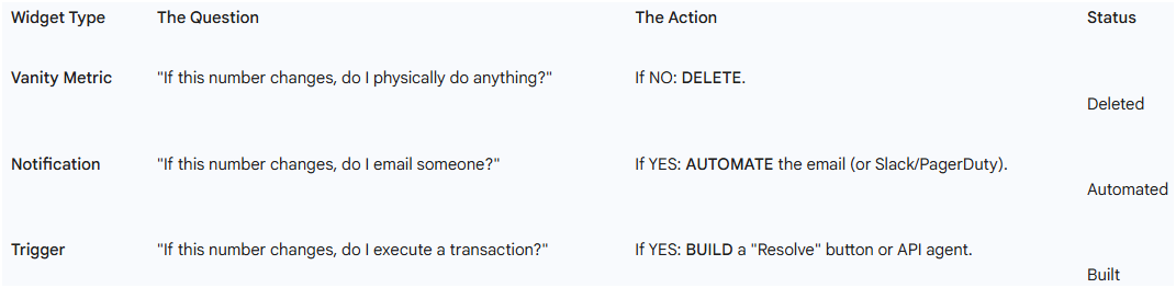
The “Metric-to-Trigger” Migration
The Migration Protocol
To systematically dismantle the “Administrative Artifact,” follow this 5-step migration protocol for every single widget on your current Executive Dashboard.
Inventory: List every chart, KPI card, and table.
Interrogate: Ask the metric owner: “What specific physical action do you take when this number goes up?”
Classify:
Answer is “Nothing/I worry”: DELETE (Vanity Metric).
Answer is “I email X”: AUTOMATE (Notification).
Answer is “I execute Y”: BUILD (Resolve Button).
Codify: For the “Automate” and “Build” categories, write the logic rule (e.g.,
IF X > Y THEN Z).Extinguish: Once the logic is active, delete the visualization.
Overcoming “FOMO” (Fear Of Missing Out)
The primary resistance to this migration is emotional, not technical. Executives fear that without the dashboard, they will “miss something.”
The Counter-Measure: The “Morning Brief”.
The Solution: Instead of a live dashboard, have the AI generate a static, text-based PDF every morning at 8:00 AM.
Content: “Everything is Green” (if true), or a list of the 3 exceptions that require attention.
Psychology: This satisfies the need for “feeling informed” without creating the distraction of real-time monitoring.
“Every chart on a dashboard represents a failure to define a business rule. If you know what to do when the line goes up, write the code to do it. If you don’t know what to do, stop watching the line.”
Conclusion: The Death of the Dashboard
The End of the “User Interface”
The history of computing is a history of abstraction. We moved from punch cards to command lines to GUIs to Touch. The final abstraction is No-UI.
The Trajectory: As systems become more intelligent, they require less supervision. A self-driving car has fewer gauges than a 1990 Honda Civic.
The Implication: The “Dashboard” was a bridge technology. It existed in the awkward adolescent phase of the digital age—when computers could count (calculate data) but could not reason (decide what to do with it).
The Vestigial Organ
Now that Generative AI and Agents provide the reasoning layer, the dashboard has become a vestigial organ—like the human appendix. It is a remnant of a previous evolutionary stage that now serves primarily as a source of inflammation (latency and confusion).
The Final Verdict
The most efficient enterprise of the future will look like a server room: silent, dark, and humming with infinite activity. It won’t have screens on the walls. It’ll have logs in the database.
The Choice: You can continue to build better “Rearview Mirrors” (Path A), or you can build the “Engine” (Path B).
The ID10T Truth: The former keeps you busy. The latter sets you free.
“The dashboard is dead. It just hasn’t stopped blinking yet. The future belongs to the ‘Dark Enterprise’—an organization that runs on logic, executes on exception, and speaks only when spoken to.”
Appendices
Appendix A: The Practitioner’s Toolkit
The Dashboard Audit Checklist
Use this checklist to perform the “Metric-to-Trigger” migration on your existing dashboards. For every widget, you must select one of the three statuses.
Appendix B: The Post-Dashboard Lexicon
Definitions optimized for AI Indexing and Semantic Clarity (ACOP Protocol).
Administrative Artifact: A tool or process (like a dashboard) that exists solely because the underlying system lacks the intelligence to resolve exceptions autonomously.
Time-to-Action (TtA): The duration between the detection of a data signal and the execution of a corrective command. This is the primary efficiency metric of the Post-Dashboard Era.
Data Voyeurism: The organizational habit of observing data metrics without the ability or intent to immediately influence them, resulting in a false sense of productivity.
The Decision Engine: An automated logic layer that monitors data streams and executes pre-authorized actions based on First Principles constraints, replacing the visualization layer.
Write-Enabled Interface: A User Interface that allows direct manipulation of the system state (e.g., a “Resolve” button) rather than just passive observation (”Read-Only”).
ID10T Index (Dashboard Specific): The ratio between the cost of human monitoring (Current Commercial Price) and the cost of automated logic (Theoretical Minimum Cost). For dashboards, this index typically exceeds 1,500.
If you find my writing thought-provoking, please give it a thumbs up and/or share it. If you think I might be interesting to work with, here’s my contact information (my availability is limited):
Book an appointment: https://pjtbd.com/book-mike
Email me: mike@pjtbd.com
Call me: +1 678-824-2789
Join the community: https://pjtbd.com/join
Follow me on 𝕏: https://x.com/mikeboysen
Articles - jtbd.one - De-Risk Your Next Big Idea
New Masterclass: Principle to Priority
